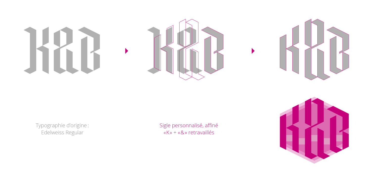
Primarily active in criminal law, K&B Avocats also represents its clients in all types of civil and administrative litigation, before both cantonal and federal authorities. Elegant and precise, the logo has a strong identity. It is based on the “Fraktur” typeface, which belongs to the broad family of Gothic typefaces. These are characterized by broken, highly angular, and pointed letters that convey a monumental and solemn appearance. The design of the “K&B” initials thus creates a compact, harmonious, and striking symbol. The logotype’s delicate lines subtly highlight the logo while lending the overall design a sense of stability and modernity. This approach sets the firm apart from its competitors while retaining the classic, traditional touch so cherished in the legal world.
(variant of the selected project)